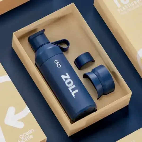
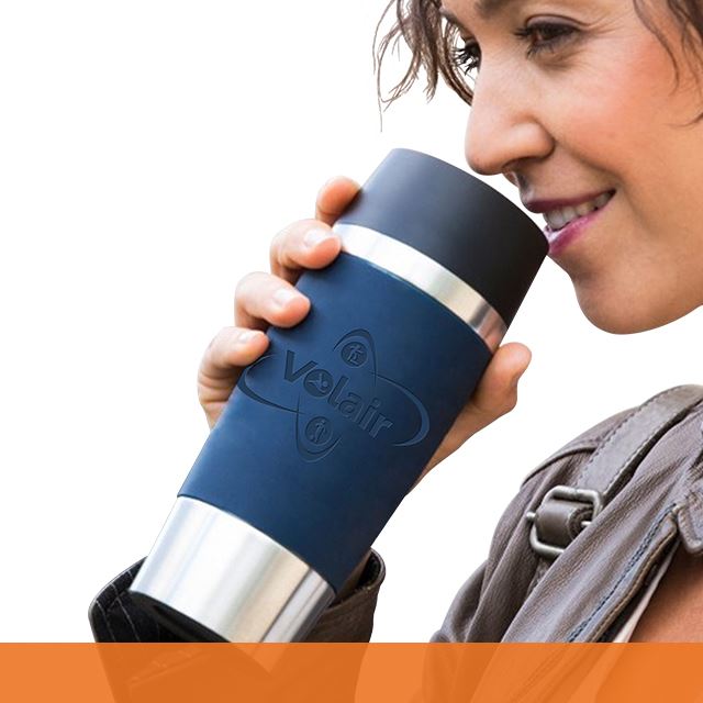
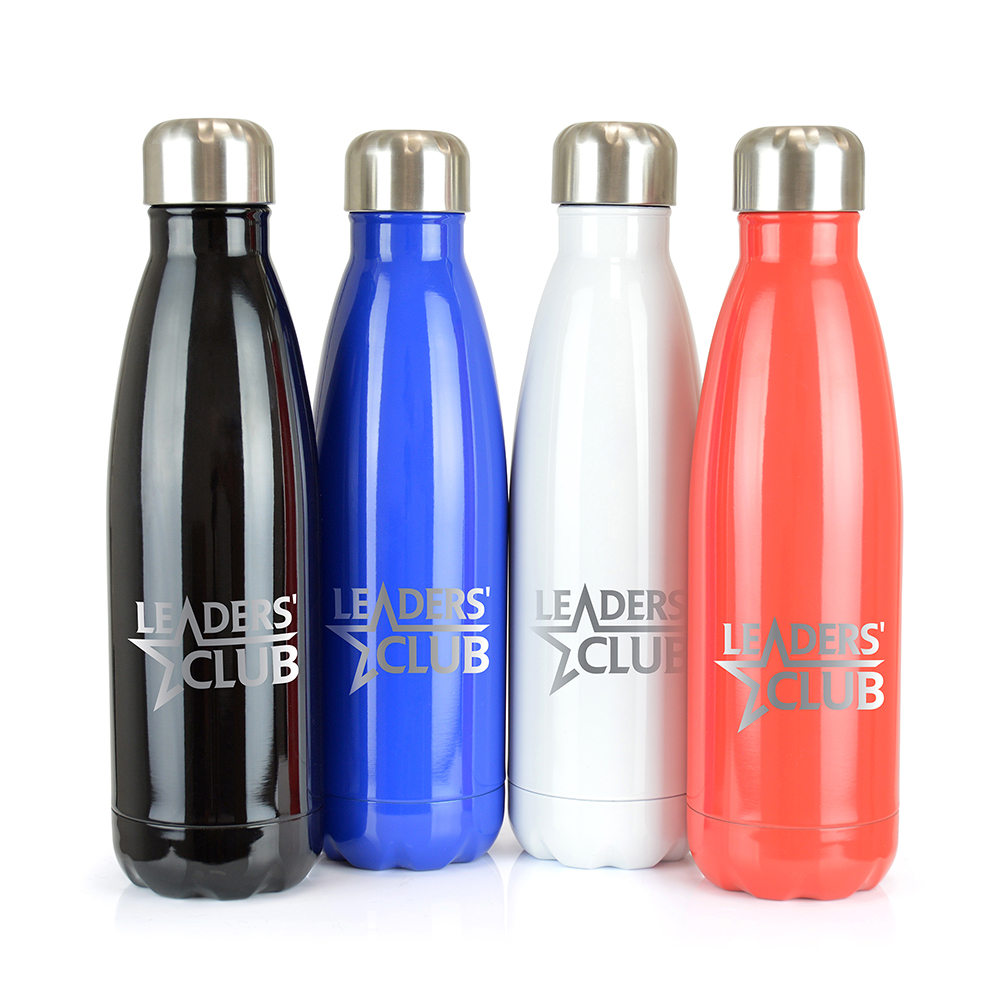
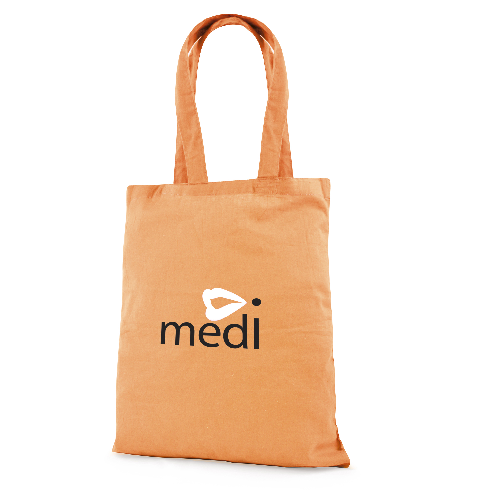
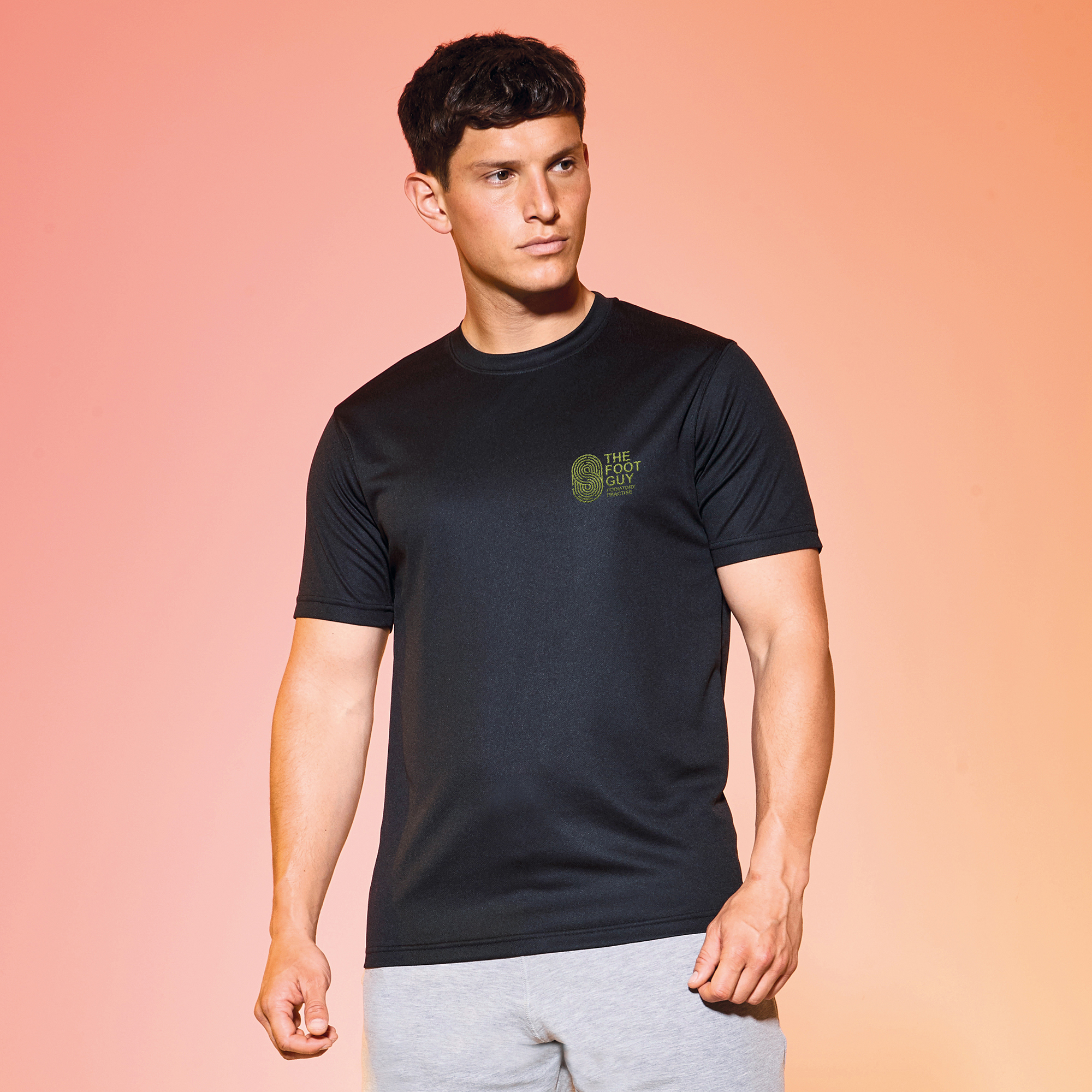
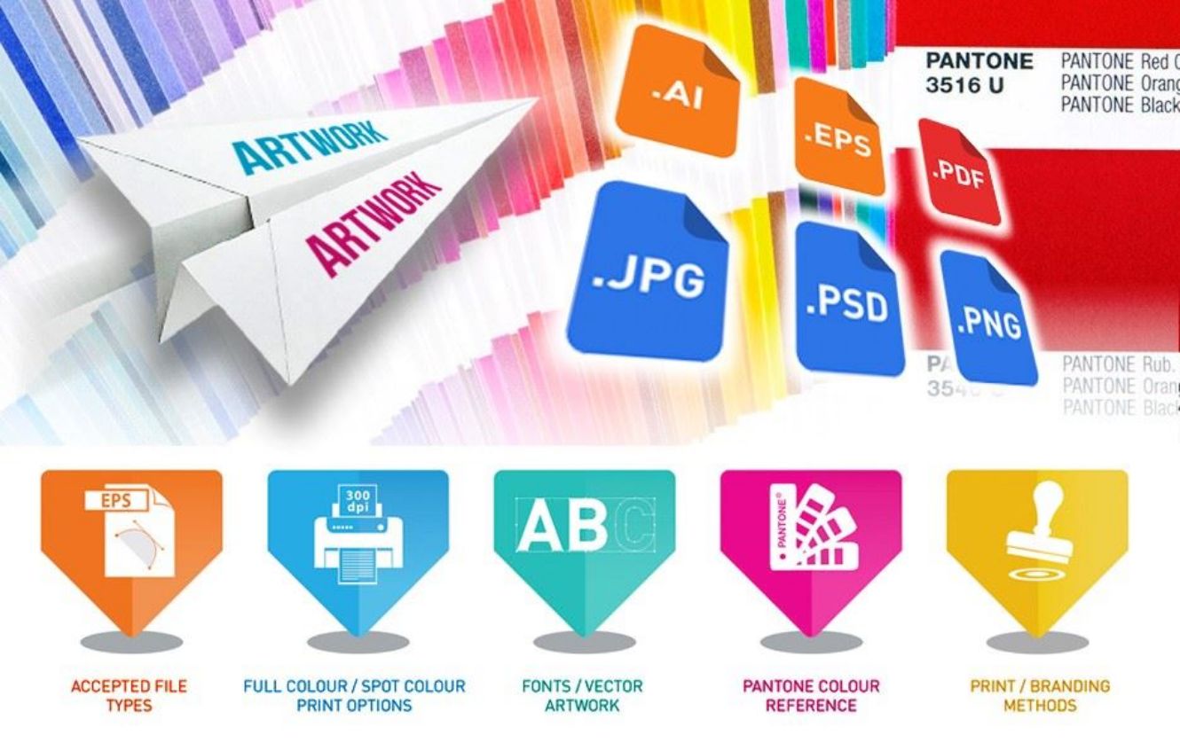
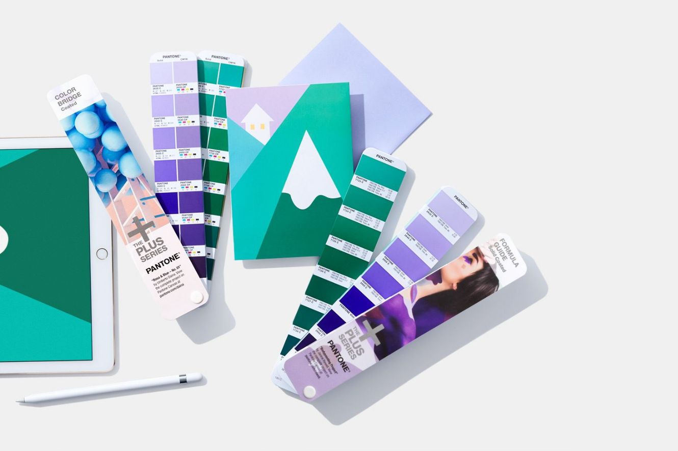
We have created this helpful guide of best practice of how to send artwork in the correct format to give you the best possible branding result so we can create some world class branded clothing, merchandise and print. It starts with accepted files types such as vector file types EPS, AI and PDF which are excellent for creating graphics that need to be resized and don’t deteriorate in quality when increased in size. Then raster images that use many coloured pixels to form a complete image. Such as JPEGs, GIFs and PNGs are common raster image types. Did you know almost all of the photos found on the web and in print catalogues are raster images & low quality DPI will give a poor result. It shows you the difference between spot colour and full colour and how this is used. Most logos have a pantone reference which is unique to a company or organisations logo and we have provided a link to our pantone reference colour guide.
Take a look at the range of Pantone colours available in the Pantone colour reference guide.
Finally, there is a brief insight into branding methods plus a link that will give you a more in depth understanding of the processes, history and capabilities of our dedicated Wild Thang team.
If this all sounds like gobbledygook going straight over your head then remember we are here to help with expert artwork advice, simply get in touch!


